
Visitor communications and meeting planner materials for a coastal Texas destination
Visit Rockport-Fulton needed collateral that worked as hard as their small team—materials that could guide visitors, support meeting planners, and represent the destination without requiring constant updates or redesign.
I developed a suite of print-first tools built around clarity and longevity: a trifold visitor brochure, a meetings incentive one-sheet, and a venue overview for group planners. Each piece was designed to be straightforward, scannable, and easy to produce in-house or hand off to local printers.
The approach
Rockport-Fulton sits between being a coastal getaway and a working waterfront town. The challenge wasn't to make it look more polished—it was to reflect what makes it accessible: proximity, ease, and authenticity.
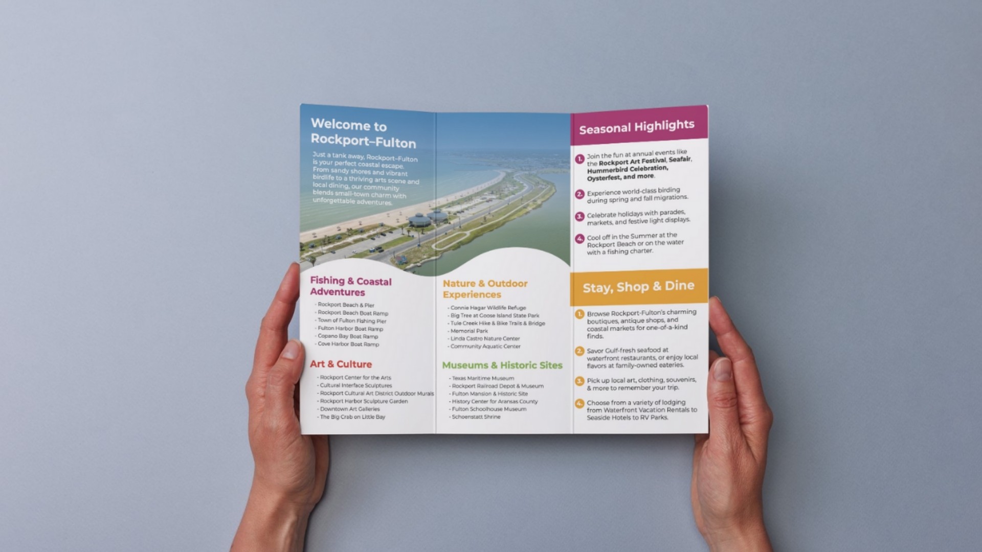
I organized content around how people actually plan trips and meetings. The visitor brochure leads with "just a tank away" and structures information by activity type, not aspirational lifestyle categories. The meetings materials focus on practical perks and logistics, not generic conference language. Everything was written to feel like guidance from someone who knows the place, not a sales pitch.
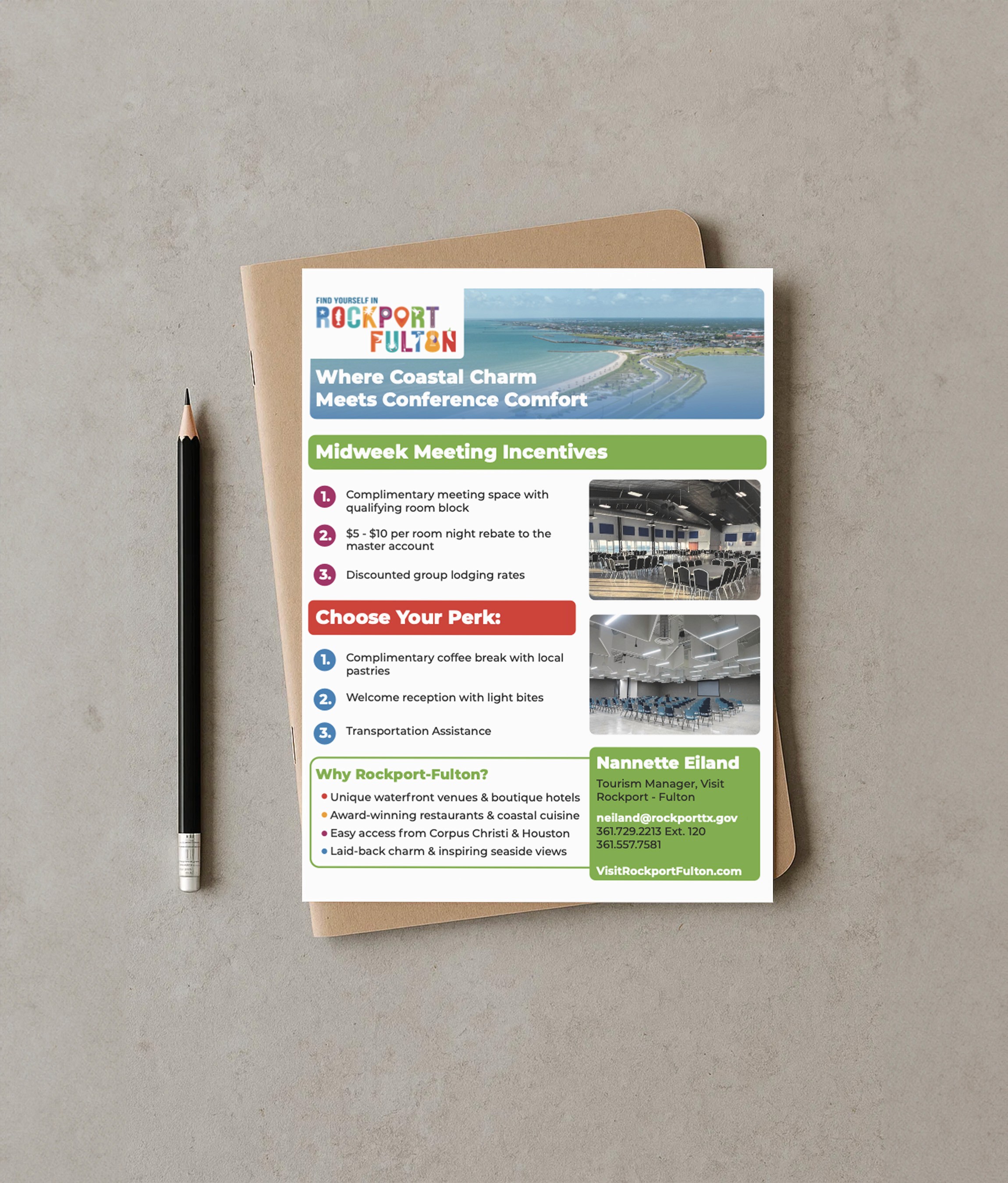
The visual system uses generous white space, clean typography, and a warm but restrained palette. Images show real scenes—piers, downtown streets, waterfront venues—not overly staged moments. Layouts prioritize scanability and give each section room to breathe, so the materials work just as well in a visitor center rack as they do in a digital PDF.
What was delivered
Trifold visitor brochure – A compact guide organized by interest (nature, arts, dining, seasonal events) with a tear-away map and contact details. Built to be updated annually without a full redesign.
Midweek meeting incentives one-sheet – A single-page overview of booking perks and destination benefits, formatted for email or print. Designed to support the tourism team in direct outreach without needing a full sales deck.
Meetings and venues overview – A two-page layout highlighting the ROCC and Fulton Convention Center, with practical specs, nearby experiences, and clear next steps. Meant to answer initial questions and move planners toward a site visit.
Why it works
These materials don't try to be everything. They're tools for a lean team to use confidently—whether that's at a trade show, in a welcome packet, or attached to an email. The content is structured so it can be scanned quickly but still holds up when someone reads it closely.
The design supports the destination's positioning: coastal, accessible, and unpretentious. It doesn't compete with larger CVBs or resort destinations. It leans into what Rockport-Fulton actually offers—proximity, ease, and a real sense of place—and presents it in a way that feels solid and considered.
This is the kind of work that ages well. It doesn't rely on trends or heavy production. It just does its job, clearly and quietly, for the people who need it.